Key Takeaways
- You can buy a home with little or no money down.
- VA and USDA loans offer true no-down-payment mortgages.
- Low-down-payment loans for first-time home buyers make it possible to purchase a home with as little as 3% down.
- State and local DPAs give first-time buyers extra help with closing costs.
Yes, you can buy a home without a down payment. First-time home buyer loans with zero down and state assistance programs make homeownership possible for buyers with low incomes or limited savings. These options provide zero down payments and flexible financing so you can buy sooner.
In this article (Skip to…)
Want to see our expert mortgage insights first?
Add The Mortgage Reports as a preferred source on Google. You’ll automatically see our latest rate analyses, buying guides, and housing forecasts highlighted in your Google Search, AI Mode, and AI Overviews.
What is a zero-down mortgage?
A zero-down mortgage is a home loan that covers 100% of a property’s purchase price, meaning you can buy a home without making a down payment. These no-down-payment mortgage loans are typically offered by government programs such as the Department of Veterans Affairs (VA) and the U.S. Department of Agriculture (USDA), which guarantee repayment to lenders if borrowers default. This guarantee allows lenders to offer financing without requiring upfront cash from eligible buyers.
Zero-down mortgages are ideal for first-time home buyers and those with limited savings because they eliminate one of the most significant barriers to homeownership: the down payment. However, qualifying for no-down-payment home loans often depends on factors like credit score, income limits, and debt-to-income ratio. Borrowers should also weigh the trade-off between higher monthly payments and greater total interest over time compared with loans that require a down payment.
How to buy a house with no money down
If saving for a down payment has kept you from buying a home, you’re not alone. Many new buyers are surprised to learn that first-time home buyer loans with zero down and other low-cost financing options can help them purchase a house sooner than expected. Let’s look at the most practical ways to buy a home with no money down and what you’ll need to qualify.
Check your zero-down home loan eligibility. Start here
1. Use a zero-down VA loan or USDA loan
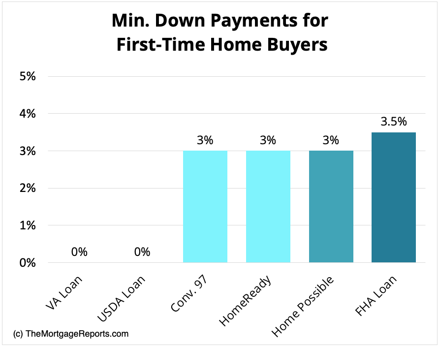
The easiest way to buy a house with no money down is through a government-backed zero-down mortgage, such as a VA or USDA loan. VA loans allow eligible veterans, active-duty service members, and surviving spouses to purchase a home with 100% financing, no down payment, and no mortgage insurance. USDA loans offer the same benefits for buyers in qualifying rural or suburban areas, provided their income falls within USDA income limits.
2. Apply for down payment assistance
Down payment assistance programs (DPAs) help buyers who can afford monthly mortgage payments but need help covering upfront costs, such as the down payment or closing costs. State and local housing agencies and nonprofits often provide grants or forgivable loans that reduce or eliminate the initial cash needed to close. You can combine many DPA options with government-backed home loans or conventional mortgages, which make buying a home even more affordable.
3. Explore first-time home buyer programs
Many first-time home buyer programs make qualifying for your first mortgage easier. Options like FHA loans, Freddie Mac’s Home Possible, and Fannie Mae’s HomeReady programs offer low down payments, grants, closing cost assistance, and more flexible credit and income requirements. If you don’t qualify for no-money-down home loans, look for a first-time home buyer program in your area.
4. Ask for a down payment gift from a family member
A down payment gift from a family member can help you buy a home sooner by reducing how much you need to save. Lenders usually allow gifts from relatives if the donor signs a gift letter confirming that the funds aren’t a loan. With proper documentation, a gift can cover all or part of your down payment and help you meet loan requirements more easily.
5. Have the lender pay your closing costs (lender credits)
Lender credits let you offset upfront expenses by having your lender pay part or all of your closing costs in exchange for a slightly higher interest rate. This option can save cash at closing, though it may increase your long-term loan cost. It’s a good fit for buyers who need help with initial expenses but plan to refinance or sell within a few years.
6. Get the seller to pay your closing costs (seller concessions)
With seller concessions, you can negotiate for the seller to cover part of your closing costs, such as title fees, taxes, or inspection costs. These concessions are written into your purchase agreement. The maximum amount varies by loan type: conventional loans allow 3% to 9% depending on your down payment size, FHA loans allow up to 6%, and VA loans allow up to 4% for certain costs (with standard closing costs exempt from this cap).
7. Explore state HFA programs
Many states offer first-time home buyer assistance through Housing Finance Agency (HFA) programs that help with down payments, closing costs, or low-interest loans. HFAs provide these programs to low- to moderate-income buyers who may not qualify for no-down-payment mortgages. You can use the U.S. Department of Housing and Urban Development (HUD) database to find local programs.
8. Consider Good Neighbor Next Door
HUD’s Good Neighbor Next Door program helps law enforcement officers, teachers, and first responders buy homes in designated revitalization areas at a 50% discount. Buyers must live in the home for three years, but the discount makes ownership more affordable for community service workers with limited savings.
What types of no-down-payment mortgages are available?
If you’re exploring how to buy a house with no money, two main zero-down home loans make it possible. VA and USDA loans both provide no-down-payment options to help eligible buyers finance 100% of their home purchase.
Check your eligibility for first-time home buyer loans with zero down. Start hereUSDA loans
The USDA loan, offered by the U.S. Department of Agriculture, provides 100% financing for eligible home buyers. While often associated with rural areas, the USDA’s definition of “rural” is quite broad, including many suburban neighborhoods. The USDA program helps buyers with low or moderate incomes, and its coverage is wide; about 97% of U.S. land is eligible.
VA loans
The VA loan is a zero-down mortgage available to members of the U.S. military, veterans, and surviving spouses. The U.S. Department of Veterans Affairs guarantees VA loans and helps lenders offer favorable rates and more lenient qualification criteria.
What are the best low-down-payment loans for first-time home buyers?
If you don’t qualify for a zero-down mortgage, you still have plenty of ways to buy a home with a small down payment. The following low-down-payment mortgages allow you to buy a primary residence with as little as 3% down.
Check your first-time home buying options. Start hereConventional 97 loan program
Ideal Candidate
- First-time or returning buyers with steady income
- Minimum 620 credit score
- Limited savings for a large down payment
The Conventional 97 program, backed by Fannie Mae and Freddie Mac, lets you buy a home with just 3% down. Borrowers must meet credit and debt-to-income requirements and will pay private mortgage insurance (PMI) until they reach 20% home equity.
HomeReady loan
Ideal Candidate
- Low- to moderate-income buyers
- Credit scores of 620 or higher
- Buyers needing flexible down payment sources
Fannie Mae’s HomeReady program helps buyers earning up to 80% of the area median income (AMI) qualify for a home with just 3% down. Funds for the down payment and closing costs can come from gifts, grants, or other approved sources.
Home Possible loan
Ideal Candidate
- Low-income buyers or first-time homeowners
- Credit score of 660 or higher
- Limited funds for upfront costs
Freddie Mac’s Home Possible program offers a 3% down option with flexible income and funding rules. It also includes lower mortgage insurance premiums, making monthly payments more affordable.
FHA loan program
Ideal Candidate
- First-time buyers with lower credit scores
- Moderate income and limited savings
- Looking for flexible qualification standards
The Federal Housing Administration’s FHA loan lets buyers put down as little as 3.5% while benefiting from government backing and lenient credit requirements. It’s a good fit for those with credit scores as low as 580, though it does require upfront and annual mortgage insurance premiums.
Pros and cons of buying a house with no money down
Buying a home with no money down can make homeownership possible sooner, but it also changes how much you pay over time. Understanding the trade-offs can help you decide if this approach fits your financial goals.
Pros:
- Lets you buy a home without waiting to save for a down payment.
- Frees up cash for moving costs, repairs, or short-term expenses.
- Can be paired with grants or assistance programs to reduce closing costs.
- Builds home equity faster, rather than continuing to rent.
Cons:
- Higher monthly mortgage payments and total interest over the life of the loan.
- Limited loan options and stricter eligibility requirements.
- Little to no initial equity, which increases risk if property values fall.
Zero-down mortgage options can be an excellent solution for qualified buyers who meet the income and credit score requirements. However, before applying, review your credit and debt-to-income ratio with a trusted lender to make sure this type of loan is right for you.
FAQs about how to buy a house with no money down
Compare first-time home buyer loans with no money down. Start hereDo you qualify for a first-time home buyer loan with no down payment?
Today’s home buyers have access to a wide range of mortgage programs. With all the low- and no-down-payment loans available, many first-time buyers can learn how to buy a house with no money down. If you’re ready to buy a house but don’t have a lot of cash saved up, ask your mortgage lender about options. Odds are, there’s a home loan that could work for your financial situation.
Time to make a move? Let us find the right mortgage for you

